

Top Ten Tuesday is an original feature/weekly meme created at The Broke and the Bookish. The feature was created because The Broke and Bookish are particularly fond of lists (as are we!). Each week a new Top Ten list topic is given and bloggers can participate.
Today’s Topic: Top Ten Covers We Wish We Could Redesign
If only the covers war more alluring, kids would be more likely to read them!
Ricki

1. Personal Effects by E.M. Kokie
This is an incredible book. I just wish the cover reflected how awesome it is. I bet Kellee will agree with me on this one, as we both adore this book.
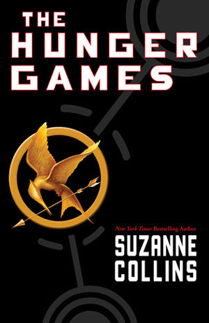
2. The Hunger Games by Suzanne Collins
I understand the symbolism of this cover, but I find it to be quite boring.
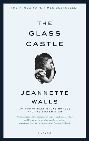
3. The Glass Castle by Jeannette Walls
This is one of my favorite books. Luckily, a quick read-aloud gets kids interested in reading it. That said, I wish the cover was different!
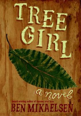
4. Tree Girl by Ben Mikaelsen
I know I talk about this book frequently. It is such a great text, and I loved using it for my struggling readers. They fell in love with it. It took some convincing for them to get beyond the cover, though!
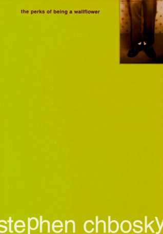
5. The Perks of Being a Wallflower by Stephen Chbosky
I love the color! That said, I wish there was more on this cover. Kids seem to either love or hate the simplicity of this cover.
Kellee
Making up for my huge list last week, I could only think of 3 covers that I would really love to redesign.
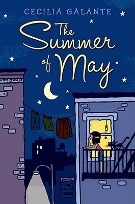

1. The Summer of May by Ceclia Galante
I will say, like Miss Movado preaches in the book, don’t judge a book by its cover. The cover (and description) of this book do not do the book justice. First, May is a 13 year old girl, not 12 as the description says and not 9 like the cover portrays. Also, she doesn’t go on a fire escape to dream and she doesn’t have a cat. I think the cover is going to drive away readers who need this book.
2. A Girl named Digit by Annabel Monaghan
This book makes Digit seem like any other girly book, but really it is an adventure-filled book and Digit is not like other girls. I just wish that it had seemed a little bit more kick butt.
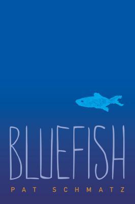
3. Bluefish by Pat Schmatz
This cover just doesn’t portray at all what the book is about and I think readers who need the book won’t pick it up because it seems boring.
Which covers would you redesign?
 and
and 
I’d add the paperback cover of Lions of Little Rock. I wish it looked less like it was targeting girl readers.
YES! I’d definitely agree with that! I hate when they gender-fy covers.
The Hunger Games has got quite a boring cover. I didn’t think to include that one.
I hadn’t thought of it until Ricki put it, but it is one that could be more interesting.
Nice list! I agree with all of your picks, lots of boring covers. My TTT.